
Blog
1,000 Projects In: What Actually Makes Websites Convert
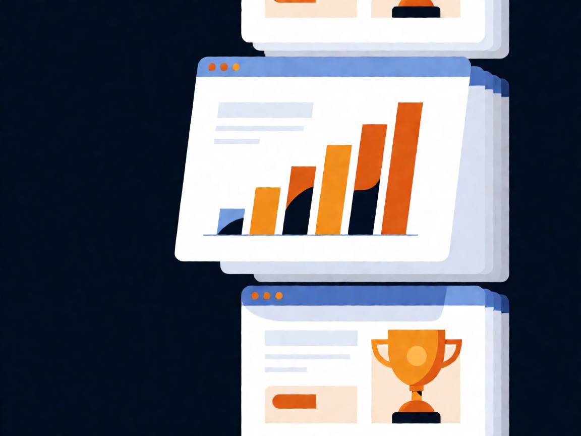
We built our first WordPress site in 2010, from a Taobao store two people ran out of a spare room. Sixteen years and roughly a thousand projects later — across 25% of the world’s countries — we’ve developed some strong opinions about what makes a website actually produce inquiries, instead of just existing.
Some of these will annoy designers. All of them are earned.
What doesn’t matter (as much as you think)
Fancy animations. Parallax hero sections and scroll-triggered reveals impress other designers. Buyers don’t care, and every animation is load time you’re spending on vanity.
The perfect shade of your brand color. We once watched a project stall for three weeks over button color. The site that shipped “good enough” outperformed it within a month.
Award-winning minimalism. Ultra-minimal sites look great in portfolios and convert terribly for industrial B2B. A machinery buyer wants specs, certifications, and proof — whitespace doesn’t answer questions.
What actually moves the needle
Speed. Not as an SEO checkbox — as respect for the visitor. Every second of load time is a percentage of buyers who never see your pitch. This is the highest-ROI fix on almost every site we audit.
Answer-first pages. Within five seconds, a visitor should know what you do, who it’s for, and why you. Most sites bury this under a slider. Nobody has ever waited for slide three.
Proof near every claim. “High quality” means nothing. “3 million pieces annual capacity, exported to 100+ countries” means something. The pattern across our best-performing client sites is always the same: specific numbers, real photos, verifiable claims.
One obvious next step. Pages with three competing buttons convert worse than pages with one clear action. Pick the action that matters — usually a quote request — and make it impossible to miss.
Fast human replies. This one isn’t the website at all. The best-converting clients in our portfolio share one habit: they answer inquiries within hours. A mediocre site with fast replies beats a beautiful site with a slow inbox.
The pattern behind the pattern
Notice what these have in common: none of them are about the website looking impressive. They’re all about removing friction between a buyer’s question and your answer.
That’s the whole game. Conversion optimization is not decoration — it’s hospitality.
If you want to see these principles in the wild, our portfolio shows client sites built on exactly these ideas. And if you’d rather have us apply them to your site, get in touch — the first proposal is free, and it’s honest even when the honest answer is “your site is fine, spend the money elsewhere.”
FAQ
What’s the single highest-impact change for most sites?
Speed and the hero section. Fix load time, then make the first screen answer what/who/why. Those two alone change outcomes measurably.
Do case studies really matter for B2B?
They’re usually the second-most-visited section after the homepage. Buyers want evidence that someone like them trusted you and it worked.
How do you measure conversion on a B2B site?
Quote requests and contact form submissions, tracked properly — not vanity metrics like pageviews. If you can’t name your top converting page, that’s the first fix.
How often should a site be redesigned?
Refresh continuously rather than rebuilding periodically. Small improvements every quarter beat a painful rebuild every five years.